Job Satisfaction Analysis
27 June 2012
I started my new job at the University of Washington in May 2012, and 2 weeks after leaving Microsoft. I have been increasingly productive, content, and lighter . That makes me ask: Why? What is so different? Let’s look, using my favorite weapon of choice: data!
Measuring personal satisfaction accurately is impossibly hard. So let’s focus on how time is spent, and consider the enjoyment factor for different tasks. The assumption is that overall satisfaction is the sum of satisfaction over various hours. The more enjoyable each hour, the happier we will be.
We each enjoy different activities. Some people enjoy meetings and PowerPoint, and some people prefer solitude and writing code. In an ideal situation our job is full of tasks we enjoy doing, and mostly avoids things we don’t like.
Being a developer, my job is composed of many different activities: commuting, meetings, code reviews, writing code, trainings, research. I gave each my common tasks an ‘enjoyment’ rating, from 0 to 13, indicating how much fun I found in the task. Meetings aren’t much fun. Writing code is enjoyable. Time spent with family and friends is fantastic. The result was an Excel file.
I find data visualization is a great aid, so I put together a Tableau dashboard. First, let’s look at how much time I spend doing various tasks at my new job, compared to the old one.

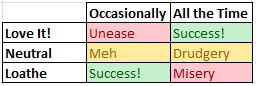
The color-coding indicates how much I enjoy the task. Ask you can see, two big shifts happened. The first is a drop in tasks I don’t enjoy: meetings and email. The second is a spike in tasks I do enjoy. The other, more subtle change was a reduction of tasks I am indifferent to, such as commuting
However, this analysis is about comparison, not composition. To see the before-and-after effect, let’s try a different chart.

The height of the line is the cumulative ‘score’, which consists of [Time Spent] * [Enjoyment]. The thickness of the line is the time spent. The effect is quite dramatic. Now I have a better answer of why I feel better in my new job. I would encourage my fellow developers and data professionals to do their own analysis in similar situations. The results can be illuminating.
PermalinkData Scientist - Part 0
18 June 2012
 I have just been accepted to the Data Science certificate program at the University of Washington. This is prep for my ideal job. I love to analyze data and solve hard problems. Lucky for me, that’s in demand.
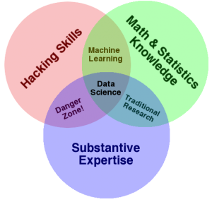
Data scientists have 4 key skills:
- Statistics
- Domain Expertise
- Programming
- Storytelling ability
These skills complement each other. I am sure you’ve been in situations where the key person was someone who knew math, the business, and the data. They are the linchpins of software and IT teams.
Classes start this fall. I will be blogging about the experience here, at DevNambi.com. I know many DBAs and developers who would be good data scientists. I know even more good statisticians and domain experts. What they all have in common is: they are ready for more, but don’t feel ready.
I don’t feel ready either. I am not willing to wait until I am…so here I go!
Permalink