Let Me In! The Attendance Challenge
30 September 2014
Many large technical conferences have a thorny problem: It’s hard for attendees to get into all the sessions they want to attend. The solution is to do a better job with session scheduling and room allocation, assigning the more popular sessions to bigger rooms.
This year, I volunteered to help the PASS Program Team predict ahead of time which PASS Summit 2014 sessions would be most popular so the team could schedule those sessions in larger rooms.
Questions to Ask
We started with some key questions. Can we predict how many people will attend each session? More precisely, can we predict the percentage of attendees that will attend each session?
To answer those foundational questions, we needed to find which factors were correlated with session attendance. Is it the time of day? Session topic? Speaker level? The track? The popularity of the speaker? Their session feedback scores?
It was clear what we needed: data!
The Program Team started collecting data about sessions from Summits 2011 through 2013, including:
- Session details (title, track, level, speakers)
- Session attendance and room size
- Session start/end times
- Session feedback scores
- Speaker popularity (Twitter followers, Bing results count)
- (derived) The percent of each event’s attendees in each session
This took quite a bit of time and the use of various tools: Python, Excel, and SQL. Finally, we had a CSV file with all of the different inputs.
Note: for privacy reasons, the session feedback scores have been removed from this file, even though they were used in the analysis.
For this initial project, we began with a fairly limited data collection; we didn’t try to do topic modeling for session content, include the amount of demos, or do more advanced feature extraction (such as calculating betweenness centrality using Twitter followers).
Analysis and Discovery
Now it was time for the fun part: analyzing the data. One of the best ways to understand data is to visualize it. Let’s see the breakdown of the most popular sessions, defined as the percentage of PASS Summit that’s in each session.
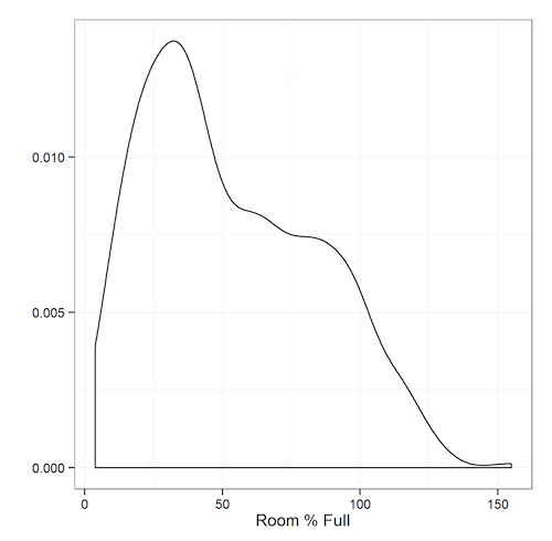
We can see that the data isn’t normally distributed; there are some overcrowded sessions, and a bunch of sessions with decent attendance. Very few sessions are practically empty.
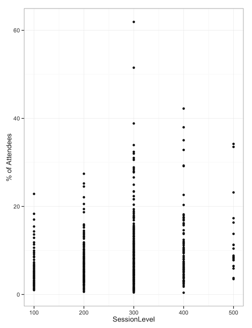
When we look at the percentage of attendees based on the session level of sessions attended, we can see that the 300-level and 400-level sessions have the most popular outlying sessions - the ones we need ballrooms for.
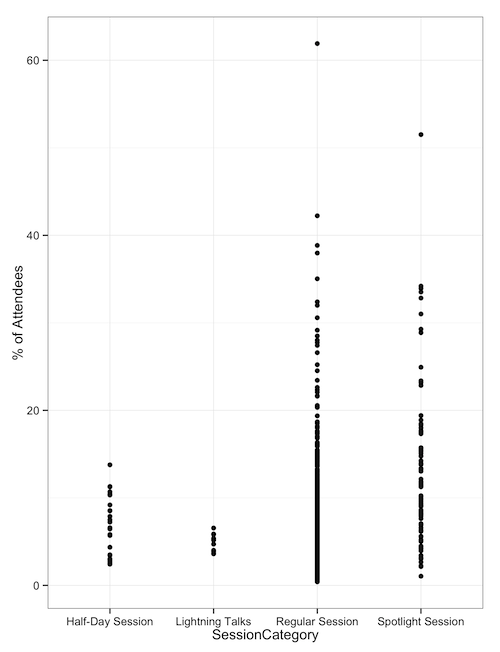
When we look at sessions by category type, such as half-days, Lightning Talks, regular sessions, and ‘Spotlight’ sessions, we see that regular and spotlight sessions are the ones with outliers. Half-day sessions and lightning talks don’t draw huge crowds.
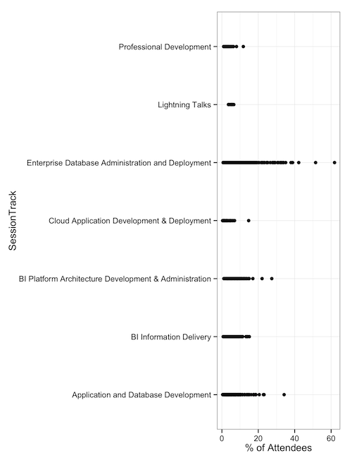
Finally, when we look at session tracks, we can see that DBA-focused sessions have drawn our largest attendance. This might be enough for some folks to make a decision: Put 300-level DBA sessions in the ballrooms. But from this analysis, we still don’t know whether the track or level is enough of a factor to matter.
Bring in the Machines
Our data set has a mix of categorical data (track, talk type, length) and numeric data (speaker Twitter follower count, session feedback scores, search engine popularity, etc. ). Also, our data isn’t normally distributed. What we needed was a machine learning algorithm that could do regression, which is predicting a numeric value (rather than just a true/false value).
There are several machine learning algorithms that work in this space, but one of my favorites for this scenario is random forests. It’s a variant of decision-tree algorithms that uses bagging and cross-validation to avoid overfitting.
One way to test the accuracy of a prediction is to predict things where we already know the answers. We can see that of the 800-odd sessions being analyzed, we can predict their attendance with a roughly 20% error rate. That means a session with a predicted attendance of 200 would have between 160 to 240 people.
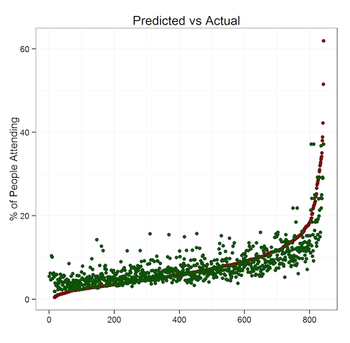
Because we’re trying to predict which sessions are unusually popular, a 20% margin of error is acceptable. Running these algorithms on the 2014 sessions data produced this output. One of the key findings: popular speakers draw big audiences regardless of topic.
We could, in theory, use a series of linear equations (or a programmatic solver) to solve this for us and build a schedule automatically. However, this is our first pass, so we didn’t want to go that far. We had predicted attendance numbers for each session; that was enough.
How Did PASS Use This Data?
With the forecasted attendance numbers, the Program Team got to work. They first assigned the sessions with the highest predicted attendance to the biggest rooms (the ballrooms) and then worked down the list. Once the first pass of the schedule grid was filled, the team made adjustments, taking into account other considerations, including topic dispersion and speaker schedule/travel restrictions.
Of course, no optimization problem like this is ever finished. So, the Program Team’s going to be collecting actual session attendance numbers, look at other inputs, and will improve the model for the future.
During “Office Hours” at Summit 2014, I’ll be joining the Program Team to talk about this effort with anyone interested. Please bring questions, ideas, feedback, and coffee. Lots of coffee.
You can also contact me anytime via Twitter (@DevNambi) or email ([email protected]).
See you at PASS Summit!