Say Anything! PASS Summit Feedback and Ratings
17 December 2014
In my last blog post, I explored some of the patterns found when looking at attendance of PASS Summit 2014 sessions. Attendees also left feedback…
Note: due to PASS policy, I am not allowed to release session rating information that can identify a particular session or speaker. I have done my best to anonymize session data while retaining its full analysis information.
Feedback Loops
The way to give feedback for Summit sessions this year was using an online form, built into the PASS Summit app. People attended sessions 36,445 times and filled out 5,382 feedback surveys, for a response rate of 14.8%. That’s a pretty low percentage, and I’ve heard that’s partly because of spotty Wi-Fi and cell connectivity.
How much can we trust this data? How closely does it reflect reality?
We Don’t Know
This is Statistics 101: sample sizes and populations. If we assume that the feedback is broadly typical of all attendees, then our margin of error is 1.62% (given 99% confidence).
The true margin of error is higher. The people who provide feedback are often the ones who loved a session, or hated it. Session feedback is anonymous, and without demographic and longitudinal data for each response, there’s no way to know.
If I was a dyed-in-the-wool statistician, I’d stop here. Instead, I’ll continue with the assumption that the data represents all attendees’ opinions.
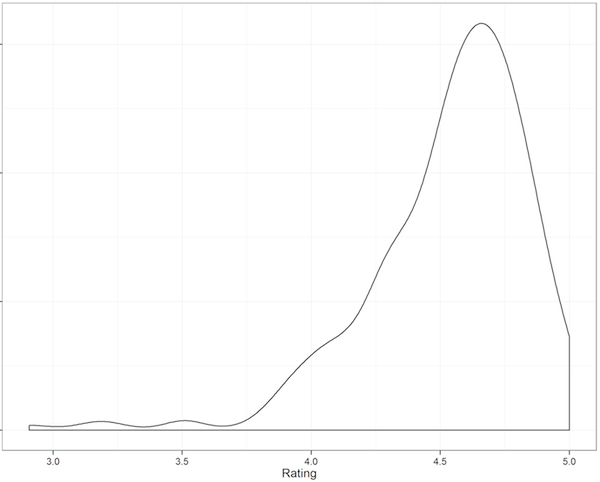
What’s the Distribution of Feedback for Each Question?
Presenters get high marks.
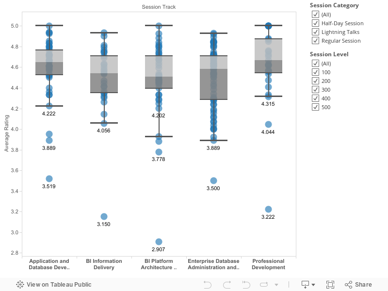
Rankings
Session speakers are often keenly interested in their ranking. Did they get the #1 most highly-rated spot, or the #3?
Due to privacy concerns, I can’t release ratings with session names or speakers. However, I can tell you the percentile rankings.
| Percentile | Overall | DBA Track | BI Info Track | BI Platform Track | AppDev Track | ProfDev Track |
|---|---|---|---|---|---|---|
| 95th | 4.90 | 4.85 | 4.86 | 4.87 | 4.93 | 5.00 |
| 90th | 4.84 | 4.84 | 4.81 | 4.81 | 4.87 | 4.96 |
| 80th | 4.76 | 4.74 | 4.75 | 4.73 | 4.80 | 4.87 |
| 70th | 4.71 | 4.70 | 4.70 | 4.67 | 4.73 | 4.80 |
| 60th | 4.66 | 4.64 | 4.60 | 4.62 | 4.68 | 4.72 |
| 50th (Median) | 4.61 | 4.61 | 4.55 | 4.52 | 4.66 | 4.67 |
| 40th | 4.53 | 4.53 | 4.46 | 4.48 | 4.61 | 4.61 |
| 30th | 4.47 | 4.39 | 4.40 | 4.44 | 4.58 | 4.56 |
| 20th | 4.33 | 4.24 | 4.34 | 4.29 | 4.51 | 4.50 |
| 10th | 4.16 | 4.07 | 4.25 | 4.23 | 4.33 | 4.42 |
Note: rankings do not include the environment scores, since that is outside of a speaker’s control
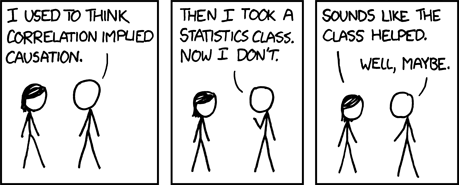
Correlations
A few weeks ago I asked folks on Twitter what questions they had that could be answered from session feedback.
A few things to remember:
- A correlation of 1 or -1 means they are 100% linked
- A correlation of 0 means there’s no relationship whatsoever
- Correlation != Causation.
Environment Score and Speaker Performance
Is there a correlation between the “environment” score given by attendees and the speaker rating?
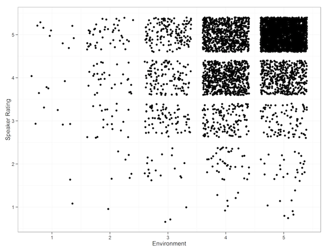
There’s a weak correlation, (R^2 = 0.377). There are also many potential reasons for this.
Enough Material and Session Length
Is there a correlation between the enough-material question and the session length?
I don’t know. There’s no information about which sessions ended early or late, unless you want to measure them using the online session recordings. There’s not enough information when comparing regular sessions to half-day sessions to derive anything useful.
Attendance and Popularity
Cynicism and Timing
Do certain time slots produce higher scores?
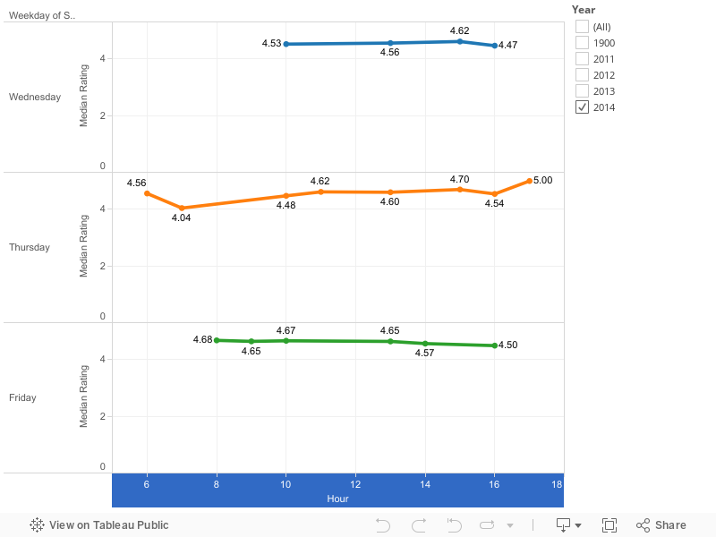
There’s no real correlation between time slots and scores. There is some variation of scores between times, but there’s no pattern I can find to it.
Speak Up, Speak Up
Do certain times of day have higher completion rates for feedback?
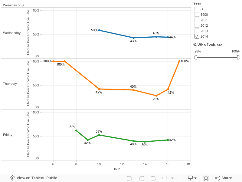
Feedback is higher in the morning, but the pattern isn’t consistent. There’s also an outlier for the vendor-sponsored sessions that include breakfast.
The Packed-Room Effect
Does a packed room (room % full) correlate with higher or lower ratings overall? No! The correlation is very weak (R^2 = 0.014), and it’s not significant (p-value 0.09).
The Bandwagon Effect
Do popular sessions (total session attendance) correlate with higher scores?
Sort of. The linkage is very weak, with a correlation of 0.031 (p-value 0.012)
Consistency
Is past performance an indicator of future success? In other words, did repeat performers improve, stay the same, or get worse?
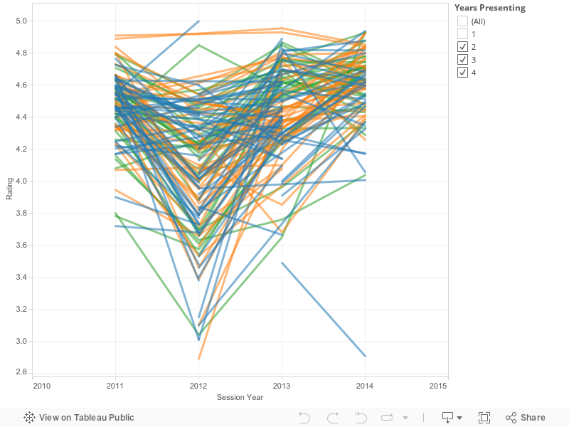
Let’s compare each year’s data with the speaker’s overall score:
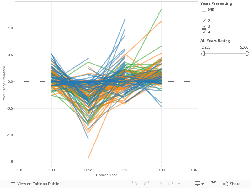
Most speakers stay within 0.5 of their average score. There are very few wild improvements or wild disappointments. However, a 0.5 difference is the difference between a 4.95 rating (amazing) and a 4.45 (in the 40th percentile).
Future Research
This work is not done. Data always leads to more interesting questions. There are many places to take this information, including:
- Comparing speaker ratings with the scores given to abstracts to see how well session selection is doing. Let’s provide data about the Speaker 47 problem.
- Adding topic and content analysis to look for patterns by session topic
- Investigating data-driven ways for the PASS community to build and identify upcoming speakers (cough SQLSaturdays cough)
- Investigating how to better gather feedback during sessions. The ~14.8% feedback rate isn’t good.
- Considering letting the PASS community vote on sessions they’d like to see. This is potentially controversial, but it does have the benefit of having sessions directly represent what the (voting) PASS community want to see.
- Using information about popularity and time slots to better allocate sessions and figure out what potential changes could be made to the schedule.
- Telling me I’m wrong. This is great - I’d rather be told I’m making an error than let that error lead to bad decisions.
- Providing more transparency around the session selection process.
Keep Going
There’s no reason I should be the only person looking at this data. The #sqlpass community is large and technically savvy. To that end I’ve made almost all of the raw data public. The only piece missing is the speaker ratings for individual sessions and speakers; that has been anonymized as much as possible at PASS’s request.
You can contact me anytime via Twitter (@DevNambi) or email ([email protected]).
PermalinkPASS Summit Attendance and Predictions
17 December 2014
Technical conferences live and die by their community. An engaged audience and talented speakers will be very successful. The goal of conference organizers, then, is to identify and develop good speakers and good content, so their audience thrives.
I joined the PASS Programs Team earlier this year to help predict session attendance for PASS Summit 2014. This data was used to help assign different sized rooms for sessions.
However, the true test of a prediction is to compare it to reality In this case, we have the predictions before Summit from the analysis I did then. I now have the conference data on attendance and attendee feedback.
This post will analyze session attendance and compare them with predictions.
Where Is Everybody
How many people were attending Summit at different times?
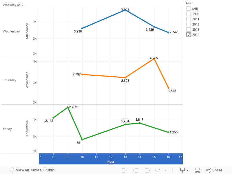
The most popular times were midday (5,400 on Wednesday) and early afternoon (4,300 on Thursday). The mornings were relatively empty. Fridays were quieter as well, with less than 1,300 people in attendance.
Measuring Error
With any prediction project, the definition of an error metric is critically important. There are a few classic examples:
- The difference between prediction and reality
- The percentage difference between prediction and reality
- Root mean squared error (RMSE)

It turns out my predictions were wildly bad. Some sessions had a predicted attendance of 323..and 12 people showed up. That’s just awkward.

Redefining Error
My predictions of sessions were inaccurate using common error metrics. They were also useful.

Overcrowded sessions are worse than empty sessions. It’s OK for a session room to be half empty. It’s only awkward when a room is 85% empty or so.
However, it’s really bad when a session is even 5% over capacity, because it means people are standing, getting turned away, etc.
Let’s redefine “error” to mean underprediction: when more people show up to a session than predicted:

There were just 2 sessions that underpredicted (the ones above the dotted line, above).
Musical Chairs
People don’t sit right next to each other at conferences. It’s not considered polite (because of elbow room, not enough deodorant, etc). A room will feel full far before all of the chairs are occupied.

Let’s count the number of sessions that were over 90% full.
| Year | Sessions | % of Sessions |
|---|---|---|
| 2011 | 32 | 14% |
| 2012 | 50 | 17% |
| 2013 | 51 | 17% |
| 2014 | 18 | 8% |
That’s an improvement. Let’s look at our success criteria: sessions that are 20-89% full:
| Year | Sessions | % of Sessions |
|---|---|---|
| 2011 | 181 | 77% |
| 2012 | 202 | 67% |
| 2013 | 196 | 65% |
| 2014 | 154 | 64% |
We can see that the % of sessions with a good attendance range stayed the same. That’s because we increased our other failure criteria: rooms that are less than 20% full:
| Year | Sessions | % of Sessions |
|---|---|---|
| 2011 | 23 | 10% |
| 2012 | 51 | 17% |
| 2013 | 55 | 18% |
| 2014 | 67 | 28% |
We’ve traded a painful problem (overcrowded sessions) for an awkward one (mostly-empty rooms). We also had 18 sessions that were over-crowded. Clearly we should do better next year.
However, this year’s PASS Summit had the fewest over-crowded rooms since 2011. During the conference, I heard anecdotes that rooms were better allocated this year. I’ll call that a win.

Keep Going
There’s no reason I should be the only person looking at this data. The #sqlpass community is large and technically savvy. To that end, I’ve made all of the raw data public.
I didn’t account for the time of day, conference fatigue, or the presentation topics. There’s quite a bit of additional work we can do to improve session attendance predictions and room allocation.
You can contact me anytime via Twitter (@DevNambi) or email ([email protected]).
Permalink