PASS Summit Attendance and Predictions
17 December 2014
Technical conferences live and die by their community. An engaged audience and talented speakers will be very successful. The goal of conference organizers, then, is to identify and develop good speakers and good content, so their audience thrives.
I joined the PASS Programs Team earlier this year to help predict session attendance for PASS Summit 2014. This data was used to help assign different sized rooms for sessions.
However, the true test of a prediction is to compare it to reality In this case, we have the predictions before Summit from the analysis I did then. I now have the conference data on attendance and attendee feedback.
This post will analyze session attendance and compare them with predictions.
Where Is Everybody
How many people were attending Summit at different times?
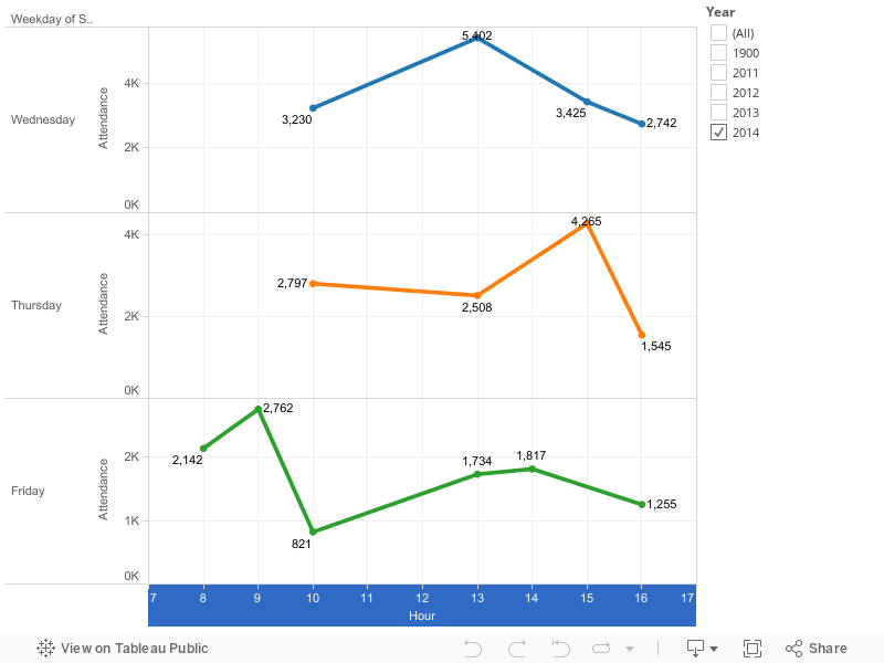
The most popular times were midday (5,400 on Wednesday) and early afternoon (4,300 on Thursday). The mornings were relatively empty. Fridays were quieter as well, with less than 1,300 people in attendance.
Measuring Error
With any prediction project, the definition of an error metric is critically important. There are a few classic examples:
- The difference between prediction and reality
- The percentage difference between prediction and reality
- Root mean squared error (RMSE)

It turns out my predictions were wildly bad. Some sessions had a predicted attendance of 323..and 12 people showed up. That’s just awkward.

Redefining Error
My predictions of sessions were inaccurate using common error metrics. They were also useful.

Overcrowded sessions are worse than empty sessions. It’s OK for a session room to be half empty. It’s only awkward when a room is 85% empty or so.
However, it’s really bad when a session is even 5% over capacity, because it means people are standing, getting turned away, etc.
Let’s redefine “error” to mean underprediction: when more people show up to a session than predicted:

There were just 2 sessions that underpredicted (the ones above the dotted line, above).
Musical Chairs
People don’t sit right next to each other at conferences. It’s not considered polite (because of elbow room, not enough deodorant, etc). A room will feel full far before all of the chairs are occupied.

Let’s count the number of sessions that were over 90% full.
| Year | Sessions | % of Sessions |
|---|---|---|
| 2011 | 32 | 14% |
| 2012 | 50 | 17% |
| 2013 | 51 | 17% |
| 2014 | 18 | 8% |
That’s an improvement. Let’s look at our success criteria: sessions that are 20-89% full:
| Year | Sessions | % of Sessions |
|---|---|---|
| 2011 | 181 | 77% |
| 2012 | 202 | 67% |
| 2013 | 196 | 65% |
| 2014 | 154 | 64% |
We can see that the % of sessions with a good attendance range stayed the same. That’s because we increased our other failure criteria: rooms that are less than 20% full:
| Year | Sessions | % of Sessions |
|---|---|---|
| 2011 | 23 | 10% |
| 2012 | 51 | 17% |
| 2013 | 55 | 18% |
| 2014 | 67 | 28% |
We’ve traded a painful problem (overcrowded sessions) for an awkward one (mostly-empty rooms). We also had 18 sessions that were over-crowded. Clearly we should do better next year.
However, this year’s PASS Summit had the fewest over-crowded rooms since 2011. During the conference, I heard anecdotes that rooms were better allocated this year. I’ll call that a win.

Keep Going
There’s no reason I should be the only person looking at this data. The #sqlpass community is large and technically savvy. To that end, I’ve made all of the raw data public.
I didn’t account for the time of day, conference fatigue, or the presentation topics. There’s quite a bit of additional work we can do to improve session attendance predictions and room allocation.
You can contact me anytime via Twitter (@DevNambi) or email ([email protected]).